Phots and text by Mark Harvey
Perhaps it is tiring to think of how fast we try to live? It seems normal for us to feel that we didn’t get what we planned done, because there’s too much to do. So much so of course that we seldom take the time to look and engage with considering what is in between all those objects and activities we traverse. We usually refuse to see. Perhaps in itself this is a tiring topic? – particularly for those that can’t be bothered with going any further. And, perhaps such an experience is indicative of the time that we are in? – of living and breathing in New Zealand in the age of privilege? Yet, as Homi Bhabha has pointed out it is in the interstices of our actions and boundaries (both material and metaphoric) where we can begin to engage with culture at a deeper level[1]. To most of us who will read this, this is nothing new, yet through our unconscious desires it is common fashion for us to forget to look there, even when it is our profession to. Quick curated by Michelle Menzies has been an exhibition by 12 artists at Auckland’s George Fraser Gallery has had certain ways of engaging with this stuff.
On the one hand there was quickness; the works at first appeared to be arranged almost as though they were randomly assigned to their footings, and the pieces themselves seemed at a glance to be swift in their gestation – maybe if you were in a hurry, you could take or leave them? A piss in a can perhaps? Perhaps not? The suggested immediacy of experience here implies that the performance of spectacle had taken place. And, perhaps the arrangement of the works flirted with being fashionable for the sake of it (?), which, in itself implies a kind of spectacle. Yet, to me in the usual sense of the word there was little in the way of spectacle in this show – no one-liners. For a spectator to experience a spectacle he or she perhaps gets a quick fix, a tickle if you please. A rise of one’s temperature and a quickening of the pulse perhaps? Moreover, Quick was lulling through the way it wooed the invisible, the spectre, that old-time intellectual beast of possibility. As Jean-Paul Martinon says, “ as the prime cause of belief, the spectre in the image is… …what makes us waver between certainty and doubt, what reveals itself in the guise of what is hidden”[2]. Quick overtly invited spectators to take time and read investigate the interstices of its objects and events.
In itself, the spectre implies a kind of spectacle, what an old friend of mine might call a kind of intellectual gymnastics – itself a quick fix. Perhaps I am going round in circles? But this is what I experienced with Quick; something intentional I suspect.
Take for instance the on line work for Quick, Luke Duncalfe’s Interlayers for Window (see archived version). With what is either not noticeable at first, or, appears to be a bunch of red lines over the Window web site was (and is) a contextual/site specific work that reflected on its location. Like a stain that will not go away Duncalfe’s patterns stick to your browser when you attempt to scroll, with its crosses, dots and cheeky pixels. The web site begins to look more like a test site, as though the web designers have not finished their job properly. For me the piece poses the question… what is it for us when things we become familiar with seem to break down, yet they still continue to work?
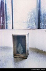
Then what is it to look at your grand father’s old nail box with a pretty perhaps even new-age but oddly-shaped rock stuffed inside it? Joanna Chow’s Rabbit is the casting of the inside of a rabbit’s insides, not so delicious after all. Perhaps this is stooped in Rachel Whiteread’s stains but she would never conceal her work and invite you to look further into the culinary, maybe even collective cultural identity of being lumped as an Asian in New Zealand society as Chow has – perhaps, put in a box because we can’t quite place it here. Chow’s One Hundred Feet, of one hundred mortar and plaster chicken feet lumped on the floor, through its alien abject-ness to the Pakeha eye, again played on our cultural sensibilities – moreover, our screened schemata of what we think is nice and foreign and Asian.
Adam Willett’s Sunny Songs and Carbon Tones might have at first appeared to be some of that highly fashionable messy process-based art that refuses to attempt to politically engage and is trying to be hypocritically un-academic at the same time. Looking into his work revealed a complex mechanism that was continuously at work and alive. Its solar panels absorbed light with variance, which in turn caused a mini chain reaction of beeps and hearing-aid sounds. Its solar panels sent currents down wires that connect to make a circuit through a graphite lightning bolt drawn on onto the wall, which set off a tiny speaker. The work was highly process-based indeed, but it unravelled the all-too-common gap between environmental issues and the role of art. While teasing apart the cleanness and hidden agendas of much minimalist sculpture sculpture it provided an alternative environmental and self-sufficient approach – enough to turn Derrida and Jenette Fitzsimons on both at the same time.
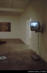
An interesting challenge for video art is to make something that roaming spectators will look at and engage in, particularly when it is framed within the context of a show of mainly sculpture and visual work, such as Quick. Punters may think that they can side-step Catherine Garet’s Three Times, but for me, after glancing at it for a split-second and then scanning the rest of the space I was left with a kind of subconscious after-image of rain trickling down a window. Each three sections, the water trickling, the hand slowly grappling the towel and the birds singing against luminescence was over-and-out quickly but sat with in me like those desires in my addictions that never go away, bump bump.
Stephen Cleland’s Bay Windows were 2 digitally enhanced photographs of the interior view of bay windows from one of those identical new houses was a deliberately random assignment. His was a tug at the practices of suburban realty advertising and the banality of those new identical houses you can see on Auckland’s fringes. Cleland took this banality to the degree of taking an hour and a half to expose his photographs, when perhaps the same image could be produced through a split second exposure. His action reflects on the share extent of superfluousness the artist as a privileged subject engages in; when thousands around the world are starving! Another investigation into banality Michelle Menzies’s Quarry showed an empty and perhaps forgotten site beside an industrial warehouse locality. Beyond the technical prowess employed in her work there appears to be little we associate with in terms of successful art. Not unlike Cleland, through her apathy of spectacle Menzies asks just that through her photos; what and who makes us measure what good art is?
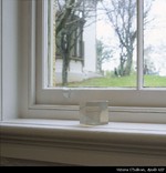
Nick Austin’s cheese and wax finger food in a bucket in Captain’s Breakfast seemed from far off to randomly lodge itself amidst a bunch of high art by mistake. His was more than just an irreverence of the ever-dominant white-man-modernist-dealer-artist that we’ve all grown to love and hate, but questioned how we should look at our own fantasies about what art should be. A return of the repressed; his chicken and chips was akin to a suburban dinner table wet-dream with bad manners, kept hidden within the sea-shanty bucket, leaking of captain Ahab’s sparkle. Like a coil of rope on the good ship Suburbia as it crashes into Artland Victoria O’Sullivan’s Sunday wasn’t too far away from Austin’s bucket. Hers were unused bread tags for Sundays only; a tug in the name of the father, and all those other bits we come to thank the art institutions for.
By at first appearing either bland or straight out cheeky, these four Quick artists played with the jouissance or unconscious and absolute pleasure that underpin our ideologies of what good art is. Jouissance has its real, it’s return from indulgence; it’s monsters, the banal, apathetic, painful and barbarian as Julia Kristeva puts it[3].
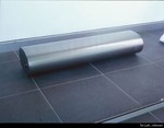
Two works to traverse the jouissance within conservative art ideologies while at first glance appearing to look like the sort of grand minimalist sculptures many of us are encouraged to make at art school were Tim Lush’s Untitled in the Window OnSite and Jason Lindsay’s Bury – Heidegger might not be impressed. Lindsay’s large varnished cardboard Mercedes Benz insignia looked like it could be made of bronze. Yet, it seemed like it had broken apart, like the uncanny things that go wrong when you try to make things perfect; Lindsay’s work poses the question, is this the problem with claiming that claiming that mine is better than yours, what goes up must come down. Through what at first appeared to be a tribute to all the big guys with his polished steel rolls and exhaust-pipe-looking apparatus, Lush’s asymmetrical steel mouldings were as though the phallus of Len Lye had fallen and Donald Judd’s lips curled in disbelief. Both Lush and Lindsay seemed to work through with the conventions of the grand, sublime spectacle that masculine minimalism so often is, while tearing at its edges.
The works by Han Nae Kim and other pieces by O’Sullivan might have appeared to be yet more scatterings at first, and with a closer examination functioned to glue the subject matter and layout of the rest of Quick. Kim’s huge and intensely worked charcoal drawings (Untitled) of a hand and water served as conceptual and visual ground for the rest of the show to imbricate itself with. Grand and sublime in nature they gave a historical context to Quick; a reminder of conventions that have been drawn in and drawn on. Sublime also were O’Sullivan’s bonsai trees (Bonsai 1-3) and her Apollo XIII, Second Generation Moon Sycamore Seed, that appeared highly crafted, encased in resin. Her bonsais were a reconstituted event from some of her previous shows, and through Menzies’s act of reappropriating them they served as a framing reference to the artist as businessman/woman; one of the previous shows was in a dealer gallery where they were on sale. Together, these works by Kim and O’Sullivan took up the most space, and through their sublime nature, that contrasted most of the other Quick works this suggests that Menzies’s curatorial performance was something that had equal conceptual/cultural capital to that of the individual pieces in the show. Menzies’s role it seems was not just to put works that she liked that might make us think a bit more for the sake of it, rather through adding in these works by O’Sullivan and Kim in relation to the other pieces was to contextualize the wider culture of current art practice here in Auckland – through Kim’s reference to what we’re suppose to think that artists do and O’Sullivan’s business plan in the current Auckland environment where suddenly dealers are taking in more conceptual works; a world where one can be successful quick and forgotten quick.


