

By Sean Cubitt
“Reification won’t get you out of the parking lot“
Things, Bob Perelman, 1986
Elective surgery! Ubiquitous surveillance! And yet there’s so little sense that anything has changed. In Aotearoa New Zealand, still struggling to cast off its colonial chrysalis, the past is that much closer: in a sleepy market town, you could be in the 1950s. Once freed from the mental chains of the old empire though, the small scale (population four million) makes it possible to spring clear of harbour like a yacht. The emotional distances and proximities are as stark as the temporalities – indigenous, 21st century, ex-colonial. Here tradition and modernity meet in the raw. Here, at the last place on earth and the first place to entert every new day, Stella Brennan writes, curates, teaches and makes art.
a stitch in time
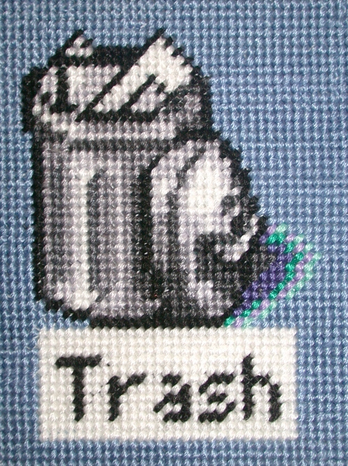
Curating a show called Dirty Pixels, Brennan made a stitch-for-pixel transcription of her Macintosh desktop to needlepoint. The design is based on a screen-grab – the date is clearly visible where it normally is in the Mac Operating System, up at the top right-hand corner. The needlepoint took over a year, and the artist had to ask her mother, husband and friends to help complete it in time for the exhibition. I have on my desktop a scan of the Trash icon made by levering the unwieldy artwork onto a flatbed scanner. There are perhaps four shades of grey, two mauves, two greens and a white involved, as well as the ubiquitous dusty blue of Mac OS8 (Brennan’s scvreen shot predated OS9, and by the time the work was done, OS X was steaming into view. Perhaps somewhere in the back of her mind was Sadie Plant’s metaphor of women, weaving and the web, and the memory of Ada Lovelace (whose name would also partly inspire the title of the group Brennan helped establish, ada, Aotearoa Digital Arts) and her brilliant use of jacquard loom control cards to manage inputs to Charles Babbage’s difference engine at back in the mid?19th century’s false dawn of the computer age.
A classic of modern design, the Macintosh desktop, as its name suggests, draws an image based on offices. This workspace is full of folders, in which files are stored. They can be moved around the desktop and stashed inside each other. In other words, a metaphorical filing cabinet. The filing cabinet was one of the elements which, along with typewriters and adding machines marked what is often called, by analogy with the Industrial Revolution, the First Office Revolution. Already in the late 19th century, the US market in adding machines was monopolised by NCR, one of whose senior executives was Thomas Watson, who took on the chief executive job at C-T-R (home of Hollerith’s tabulating machine), which in turn, in Febnruary 1924, became IBM. But the continuities between the First and Second (digital) Office Revolutions are not restricted to business histories. The First Office Revolution drove down wages by deskilling double-entry book-keepers and the artisans of copper-plate orthography. In the place of these highly-trained men, under-educated, under-unionised and under-paid women would move into the office. The computer – in particular the command-line interface– may have been a masculinised space: the Macintosh desktop metaphor addresses a workspace that had become, in the previous hundred years, a feminised one. So it seems appropriate that the desktop, initially envisaged as the intuitive metaphor for office workers but describing an increasingly domesticated machine, should own up to its femininity, and be transported into an older feminine discourse of sewing.
The needlepoint desktop is also very definitely about time. “The physical process of creating this work is an important part of the piece“ Brennan wrote in 2001. “I have been embroidering for over a year to render a desktop snapshot that took a fraction of a second to capture. The embroidery has become for me a tactile exploration of the metaphors of the Graphical User Interface“. The tactility of pixels, the replication of the cathode ray tube scan as stitches, the textile surface: all of these speak simultaneously of the qualities that slip away from the digital display, touch and time. The instantaneous betrays its long making. Karl Marx analysed technologies as dead labour, the ossified and accumulated manual agility of the centuries abstracted and congealed into machinery. In manufactures he sensed the vampyre capital fastening on the blood of the workers, but we, for whom these machines are familiars might instead think of them as the anonymous, mute, exploited but everpresent ancestors assembled at our finger tips. The stitches of this screen, which is not a screen, and which are interactions far more than most of our interactions with its digital analog, are past in a way that the screen is not, even when its design comes from what we now rather coyly call ’heritage’ computers. The eternal present of visual display units is of course a mask, a snare and a delusion. The stillness is a product of refresh rates, the quiet hum evidence of hurtling electrons and mathematical frenzy microns below the lcd. Behind this glassy but turbulent surface lie the ghosts of those who made it. Extending that moment of perception across the months of sewing stretches out the present, and in its elaborate pun stops the magic from vanishing from the screen altogether. Because this is also a tapestry, of the kind Rapunzel or Penelope might weave, and is itself a thing of beauty and an achieved piece of work, as it would be if it showed unicorn and maiden in place of hard drive and trash can.
Although this way of working references the masterpieces of the past, Bayeux, let’s say, and displaces battle with peace, it is also a homage to those countless generations of sewing women, working women and the daughters of the wealthy denied labour but encouraged to sew, whose art this was, largely excluded from the museums and wholly from the galleries, disprised, marginal. It is in such margins that Stella Brennan discovers her materials.
Such for example are the clip-art samples, the quintessence of non-art, downloadable from Microsoft’s website. Blown up beyond their usable scales, the images, all of them derived from iconic and occasionally sacred sites in Aotearoa, become artefactual, splinter, break up, crumble into the inadvertent cubism of pixellation, Cézanne without the cylinders and spheres. Equipped with wall-mounted magnifying glasses, viewers can home in on the breakdown of this mute language of landscapes and tourist vistas. Beside them in a vanishingly small typeface is the legal agreement users enter into when they download one of these seemingly innocuous pictures, a screed that marches down the wall, the legal banner of Microsoft’s lawyers laying claim to landscapes they have never seen. Omnivorous, blind, globalisation colonises every landscape not with muskets this time but with legal instruments it otherwise dissimulates under the innocence of postcard imagery. But still these picture-perfect pictures retain their absurdly jolly attractiveness, in that glassy, faultless and numb fashion that we know from flicking through magazines in dentists’ waiting rooms. In at least one, typically curious, typically elliptical, typically wry way Stella Brennan is a landscape artist.
Did I say numb? Not numb in the offensive, glib pose of Gerhard Richter’s Atlas, where the orgy and the deathcamp sit uncommented side by side in the assortment. Numb as in the ’whatever’ teenagers say, the ’whatever’ that Thierry de Duve noted was also at the heart of the movement of modern art towards art about whoever (Pisarro’s cabbage growers, say), or whatever (Van Gogh’s old boots perhaps) and then an art made of whatever (Picasso’s bus tickets, Schwitters’ Merz). Numb like the numb heart of the commodity revealed when the glamorous goods are gone and all that remains is the unglamorous packaging. As Microsoft’s legalese is the unwanted, cast-off packaging revealing the vacuity of their clip-art, and the vacuity that in turn disguises the genuine offence, so too is packaging cast off both vacuous in the most literal sense and an offence: litter. Iterate litter. Litter reiterated as literature: a wall of mysteriously lovely styrofoam casts, a barrier pretending to be a light source resonating with the acqueous digital sound of a heavily compressed recording of a waterfall in 2000’s The Fountain City. More packaging in Fedex the same year. Scans and assemblages of scans of polystyrene packaging appear in 2002’s Another Green World in Sydney creeping round the walls of the video installation Theme for Great Cities a year later.
In the last-named, you can only approach the video monitor inside an igloo made up of the flattened remnants of the boxes in which Apple’s then premier machine the G4 arrived. Perhaps there is some fine art memory here, of Woydizcko’s Homeless Project maybe, or some of Jeff Wall’s digital cibachromes, those instants of impossibly vivid deracination. A hovel made of the wrapper that delivers the tool of choice for dream-makers, commercial artists. Is the Mac G4, fetishised design icon, degraded? Does it find here alone its reason for existing, away from the hidden recycling yards of the over-developed world? It’s curious to crawl into this space, self-conscious (“does my bum look big in this?“) but also of course a uterine environment; the hovel is humble but homely, and the sheer proximity to the big screen tv incongruously housed in it is reassuring, like a child’s-eye view of electronic modernity.
On the soundtrack plays one of those artificial voices they add to computers to read your text back to you, (I believe this voice is Macintosh’s ’Ralph’). Preparing text for this speak-back function is harder than you think. You have to change the spelling to match what the programme can handle, and provide gaps and punctuation to coax it to more credible periods. There is a certain skill to using even these built-in, ready-made voices; a certain skill to stripping the readymade of its intrinsic meaning, the meaning it gleans from being purely digital, so that like the packaging it can reveal the impurity of digital margins, the dirt among the pixels. The voice reads a passage from Raoul Vaneigem. The hedonist among a hedonistic sect, Vaneigem was the near-forgotten sidekick of Guy Debord in the Situationist International, perhaps least forgotten for his treatise on anarchist self-indulgence A Book of Pleasures. During the late 1990s the art world rediscovered the Situationists. I’m not sure what this means except that October sponsored a book of translations with an emphasis on the art world shenanigans of the group, rapidly depoliticising what was briefly the voice of the disaffected intelligentsia in revolt against de Gaulle, and left in Debord’s Society of the Spectacle a masterwork of anarchist analysis in which along with the rest of consumer society the art world itself is pilloried as the decorative hat on the military police chief. This test of Vaneigem’s is then not without its maculate provenance. He is one who wanted to be one with the homeless, as here, burrowed into this unlikely igloo, the viewer too becomes one with the street people even though he is in the gallery and they are still on the street. “Urbanism is the most perfect and concrete fulfilment of a nightmare“ it begins in its granular baritone. The voice is nearly comic, a cliché, a voice that isn’t a voice speaking words that it cannot speak and that are not its words, a ventriloquist of a translation of words of a dead man. The viewer begins to feel a hand up the back of his jacket. The voice speaks of “total mind control“. You fear the ventriloquist is mad. But all ventriloquists are of course schizophrenic, and the dummy is always the villain. All this and more we have learned from television.
And on the video screen – I was getting to that – there rolls a blurred but steady pan – I thought of the pan that gave the technique its name in Porter’s Panorama of the Columbian Exposition by Night of 1902, where the pan proceeds in daylight over the midway of the exposition grounds to the middle of its course before, on a hidden cut, fading to the same 180 degree pan continued in darkness punctuated by the million electric lightbulbs of Porter’s employer, Thomas Edison and the Edison Company. The analogy is flawed. Brennan pans left to right. Porter had but the grayscale of the available film stock: Brennan exposes her camera to grays and whites but also to reds, blues and greens, the primaries of digital video. Porter continued his left-to-right pan after the midway point. Brennan stops about halfway and fades, like Porter, to black. But then when the image begins again the motion is vertical, from bottom to top, but, and here is the nub of the analogy, it is mirrored (a fragment of script tells us that the right-hand side of the screen is mirrored on the left: a kind of symmetry with the first part). The set, for that is what appears as the focus settles or your eyes acquire some familiarity with the proximity blur, also contains a mirror that inverts those letters, so we see them first upside down and moving in a stately process down the screen as their as-yet unseen originals progress towards the frame from above. The Lego bricks are now clear, and the pans become more like an serene remake of Blade Runner’s demotic architectures. Brennan’s camera move becomes parody of miniature set design that reveals in their infantile stature the modellled schemes of architects like Corbusier and all those in broken line back to Haussman, the urbanist who first showed himself ready to sacrifice the population of Paris to the militarist imperative of his boulevards.
The Vaneigem text ends with an ironic “Project for a realistic urbanism“ which abandons the earlier-enunciated faith in a ’building instinct’ stolen and marshalled by social hierarchies into the construction of carceral cities. He promotes, but in the deadpan voice of “Ralph“, Piranesi with elevators as a model for the subway.
On the walls of the gallery outside the viewing hovel is a paperchain of scans from the styro-packaging of a G4. It forms a kind of map, an avenue that bends with random moments but suspicious repetition of modules round the space to converge upon the simulacrum of the void where once rested the machine on which the video was edited and the soundtrack synchronised. It is, as a documentary photograph from the interior of the Fountain City testifies, a lovely absence. Lovely like Rachel Whiteread’s House, or lovelier because unmarked by personal memories, the physical trace of wear, the unnoticed damages of mice and beetles. A spiritual space, though not a holy one (“The temple is holy because it is not for sale“). The void is the central mystery of commodity capital. For much of the twentieth century the philosophers thought the great secret was death, and that because they had lost their faith the world had lost its mystery and death its purpose. Only the best of them recognised that death and godhead still held hands, that birth was the critical moment of tragedy and comedy alike, and that the greatest anxiety arises not from fearing that death is meaningless but from realising that life is. Capital is cynical: in Wilde’s definition, it ’knows the price of everything and the value of nothing’. BUY EVERYTHING. In the infinite exchange all things are swapped for the one thing that has no content or use: money. Thisblack hole of meaning over which must be constructed and reconstructed every day the vast engineering projects of styrofoam utopias, last refuge of the rascal, last plaything of the dispossessed.
Theme for Great Cities occurs, as is entirely appropriate, at the corner of something and nothing. This too is the suggestion I take from ZenDV inspired obviously by Nam June Paik whose Zen for Film appears at the corner of textbooks on the history of cinema and the many artworks of Fluxus everyone knows but few people have witnessed. The motifs at the heart of this work are unbearably familiar to people working with digital non-linear editing systems and liquid crystal display data projection but are otherwise largely unfamiliar, certainly to anyone whose confrontation with electronic media is pre-digital. Unfamiliar but ubiquitous, the colour bars mark the signature responses describing the colour gamut of monitors, while the blue screen is the default projection of a reference colour when no signal comes in to the system. The blue is also the reference tone for chromakey, the device used in compositing images from different sources into a single image. But the colour gamut is of a different quality again. The red, green and blue bricks of the first half of Theme return alongside their negatives, cyan, magenta and yellow, with black and white, in patterns designed to help calibrate the colour response of a given screen. It is no secret that monitors each have their own colour responses, vagaries of manufacture, but also signatures of company-specific technical solutions to the problem of colour reproduction. The purest colours are not necessarily the ones which are either most easily produced by the phosphors used in screen technologies, nor the brightest. The closer red comes to infra-red, or magenta to ultra-violet – the closer that is to invisibility – the dimmer they appear. Colours are shifted automatically by our machinery into the reproducible and the bright. Video black is a problem of its own: the monitor is a light-source. It does not take kindly to being asked to project the absence of light. Different machines use different gamuts to secure the best illusion they can. Some use an absolute distance between contrasting colours. Some shift them relative to one another to get a credible compromise. No screen reproduces the wavelengths that the world delivers to cameras or our eyes. The colour bars aid the editor to adjust the screen towards the best response for her film. Already evidence of slippage, they are ripe for a further slide.
A further reason why the editor needs colour bars is that every digital image goes through a series of compressions on the way to the screen. By their nature mathematical matrices of colour and coordinate codes expressed in numbers, the data which represents an image can be reconformed as the image that represents the data. To get from here to there, from hard drive to monitor, from file to tape, from tape to broadcast, the image reverts to its mathematical nature. The data is rewritten both to suit its destination medium, and to ensure a speedy move from one to another. Each presentation, each transmission, may require a different compression. The colour bars are a way of checking the results against the nearest thing we have to a universal standard. The fact that this standard is also a tool for adjusting the colour response of screens shows how tentative are our attempts to fix universality against the relativism of mechanical perception. A smarter sense than eyesight, hearing checks the reference tone, that high pitched bell-like sound, for evidence of changes in speed in playback.
So in ZenDV we might contemplate the marginalia of broadcast and projection in and of themselves. It might be enough. They offer a kind of authority, a sense that among the imperfect images there is a reference which, unstill and malleable though it is, can form a gently wobbling pivot about which the imagescapes and soundscapes of digital media might revolve. Brennan’s ploy is again a typical one: to exploit a little tool, a filter in Apple’s video editing software Final Cut Pro, that adds bogus scratches to the video and audio tracks. The purpose is to imitate film, which being a ’wet’, chemical medium, has a tendency to age visibly; to add speckles and dust, hacked into the emulsion or lying on top of it, so that old film prints look their age. The digital image is too clean, too much inside its own black box, to fool anyone that it is old, not without a trick. These randomised pops emulate the evidence an old filmstrip gives of its longevity. In this way, they reverse the process of the embroidered desktop, adding the appearance of age and experience to a signal that has neither, whose universality denies the specificity of the speck of dirt. Dirt is the evidence of reality. Dirt is, as Margaret Mmead said, ’matter in the wrong place’, but in the digital arena, and especially in the field of reference colour bars and reference tones, there is no ’wrong place’ that is not first decided. The decay of digital images is abrupt and structural. They lose integrity, the field of the image begins to fragment into blocks, patches go missing. There is not the molecular decay of silver salts suspended in quasi-rigid solution in the emulsions covering a film. The staccato puttering of the soundtrack is a symptom: a cinema projectionist would recognise its regularity as a sign of dirt lodged on the revolving sound head. But here there is no sound head to revolve, and the rhythm is symptomatic of nothing whatsoever.
In its first iteration, Paik’s Zen for Film was an hour of white screen, the film strip exposed as negative, printed to positive, and translucent, the sheer light of the projector itself. One might contemplate it as a shaft of light, as much as an illuminated screen. It slight flicker, an artefact of the shutter’s flicker, a pulse at the edge of perception. But as the filmstrip aged, so it began to gather the random evidence of its biography. John Cage noticed its accumulation of scratches, and understood how it began not only to trace the illusion of cinema but the reality of the real. Paik’s ZenTV appeared in several versions. In one, a videotape filled a monitor for one hour with white. In another, a statue of the Buddha contemplates its own image in a monitor displaying a closed-circuit television image of the Buddha. In both, the specificity of the medium, its distinction from film, is significant. The Buddha version is a live broadcast – albeit one on which nothing occurs. Let me pronounce that differently: in which Nothing occurs. It is Paik’s achievement as a metaphysician and ontologist that he created a work in which Nothing appears as itself, in which there is no ’something’ to happen. He might as well have put a stone in front of the camera-monitor set-up, or a carrot. The irony of Brennan’s digital variant is that something happens alright, but something that has no existence. The something that occurs – the pops and speckles – are of one kind with the colour bars. Far from evidencing a history or symptomatising an intervention of reality into the machine, they are a potentially endless, mathematically-underpinned random noise.
One further step. Noise is a special something in systems and information theory. By definition random, noise is the opposite of information. Like the crackle on a phone line or the scratches on a film strip, it doesn’t signify. Information theory, however, is probabilistic. If we have a conversation, the chances are we’ll say the same things everyone says to everyone else (how are you? I’m fine. How are you. Fine. Nice day. Sure is). Repetition is also insignificant. It tells me nothing new. It isn’t information. Somewhere between totally random (improbable) and totally ordered (probable) lies significant, meaningful, informative information. The irruption of the improbable makes the probable meaningful. Dust on the universal colour bars is therefore information. And noise on the soundtrack is noise. But this noise, generated by an audio filter to emulate the hiss and scratch of worn vinyl, is not random – the noise not noise. It does not evidence the presence of the world accumulating on the surface of a filmstrip: instead it demionstrates the absence of that kind of tactile history of the object, and in ruling out the past of the artefact, it rules out the possibility that these scrastches and crackles are symptoms behind or before whioch some absent cause lies hidden. There is no time before, as there is no space beneath what you see here in endless loop. And yet somehow you cling to the significance of the inflicted damage, such that ZenDV intimates another, a digital dimension where these things signify. Impossible signification in some other dimension. Zen.
Comparing and contrasting Theme for Great Cities and ZenDV suggests a double structure to Brennan’s art; on the one hand a radical politics, on the other an ontological enquiry. It is not extravagant in this context to evoke David Batchelor’s concept of chromophobia, a distrust, dislike, even hatred of colour in the rationalist trajectory of Western culture, and to suggest that the colour bars themselves refer to the Colour Bar, the premise that the pure and undefiled light of God and Reason is most sacredly upheld in the diminution of colour and the single monad of the white light and the pure tone. It is against all such totalities, all fabricated purities, that Brennan’s work rages. Homelessness does not of itself displease her, only that it too is part of the grand anaesthetic of the city, of architecture as mind-control. The homeless hovel is, after all, a thing invented, built and maintained by the intuitive architect who lives in it, where the good citizen merely inhabits what has been built for him.
This rage against urbanism expands across two recent pieces, Tomorrow Never Knows and Citizen Band. In the years since the second world war, there have only been a handful of moments when utopianism entered popular culture, not as a substrate but at the centre. One of those was the counter-culture, despised since punk by successive commercialised fashion styles that lacked the political will of either the pnks or the counter-culture on which they fed and which they rightly rejected. What is more stupid than yesterday’s utopia? The house of tomorrow in those yellowing magazines, the wall-sized screens, the hippy chicks in floral print miniskirts at the stalls of the Ideal Home Exhibition. This architectural haunting began with the video door of 1998’s Zen (a distinct work from 2002’s ZenDV). Now affordable domestic LCD projectors are in striking distance, along with protable video phones, has the future caught up with the past? Can we give up nostalgia for white ovoid plastic chairs and circular windows? Or are those utopian-dystopian tales of JG Ballard, tales of the prima donna with insects for eyes, of crystal forests and drowned worlds, roosting again among us, their acid colours and their brittle metallic sheen?
In the 2004 installation Tomorrow Never Knows the screens play images derived from Apple’s sound visualisation software bundled with iTunes, a psychedelic swirl which, Brennan suggests in her notes on the work are “an evolution of the glowing, bubbling lava lamp“. The audio track is, sure enough, from JG Ballard’s early tales, a story of architecture that rebuilds itself in response to its user’s moods. I remember reading the story years ago, a young teen, and recognise the foreboding as another computerised voice recites, this time accompaied by an computer-generated mobile mural. The title, you will no doubt recall, is the name of a track form the milestone Beatles’ album Revolver. You might be forgiven though for a momentary confusion with a James Bond film. The same 60s blend of utopian and dystopian, the same readiness to play with the fantastic, in architecture, perhaps like one of those Bond villains’ lairs, or in the early inklings of a hybrid world music a decade before Womad. Those dreams, will they still haunt us tomorrow as they do today?
In the corner by the yellow light of a floor-mounted lamp images that tell the story of the geodesic dome, a paradigm expression of the Whole earth catalogue, the first populist expression of green politics as a lifestyle option outside consumerism. You see the photograph of the Montreal expo dome with smoke billowing out of it and recognise the burning of an era, as surely as the twin towers in flame mark the gateposts of the twenty first century, the vulnerability of the last empire, motivation for its abolition of shame. As Buckminster Fuller’s baby burns, you can almost hear the architects relief – back to business as usual. back to clearing the mess of radio Alley to build, in monumental grandeur, that triumphant monument of the information economy triumphant, the World Trade Centre*.
It is dangerous to argue by analogy: where would you stop? If there is an analogy between the cityscape and cyberspace, isn’t there one with the Heavenly Jerusalem and the weird little city Superman used to keep in a bell jar in the supercave? The video for Citizen Band is like a reprise of the video component of Theme for Great Cities. In fact it is a reprise. Perhaps we didn’t get the point the first time round. The script derives from Hundertwasser, the Viennese artist and architect who adopted Aotearoa as his second home and left as his major memorial a glorious public lavatory in the Northland town of Kawakawa. Serpentine mosaics and recycled bottles, a green reincarnation of Gaudí. Like Vaneigem, Hundertwasser was of an anarchist persuasion and a hedonist, but a hedonist who recognised the expenditures involved in pleasure, not only from the enjoyer, but from the system in which the enjoyment takes place. Playful and popular in the way Klee is playful and popular, Hundertwasser’s original contribution lay in developing a green consciousness, extending the social articulations of early radicals into their debts to the biosphere. But this doesn’t make him misanthropic: on the contrary, nor elitist; quite the opposite. His Vienna housing development is entirely devoted to working class accomodation, and the cooperative who still run it are grassroots in every sense. So though there’s a reprise, there is soemthing else, a development from Vaneigem’s ironic rhetoric towards an emergent aesthetic, not of individualist self-fulfilment as in the old French tradition, but of collectivist harmony with the natural and social environment that comes from the long struggle of the working class. No-one else suffers as much from pollution. The voice here was perhaps “Vicki“, but sweetened. She says, for Hundertwasser, “The ruler is the symbol of the new illiteracy“, in a metaphor whose mixtures restage the transitions from German to English, from living to dead, and into that ubiquitous dialect which has no home, International American English. Let the buildings collapse, she says, let the huan sacrifice occur, rather than suffer the moral uninhabitability of modernist utilitarian architecture. Better mould than straight lines.
The video track describes a fantastic architecture, but this time a utpoian minaret built from a radio antennae, oriental bronze pots, poured-glaze ceramics, bric-à-brac. The curves come just as the voice suggest their existence might be preferrable to ’the chaos of straight lines’. But the video pans vertically down the structure; then fades to black, and cuts to a horizontal pan laid over a pastoral valley, which stays in frame as the chromakeyed pan shifts to vertical, and only then,. as the pastoral blinks out of view, changing to a diagonal drift to follow the slanted aerial. Another cut to black, and a tirade against Corbusier, Gropius, Mies and Loos, patriarchs of the New International Style in architecure is accompanied by a grainy posterised zoom out on a fantastic miniature urban scape, rich blacks, sleek glazes, a fleshy, fruity pink pear-shaped gourd. Moments before the zoom and the voice cut to silent black, their outlines recall nothing so much as the nine malic moulds, Duchamp’s bachelors in the Large Glass, themselve sinspired by chess pieces, and anchored to the perpetuum mobile of The Bride Stripped Bare by networks of desire and propulsion.
Ecological thinking is all about networks. It takes the conceptualisations of informatiom theory and begins to root about in them, adjusting the first generation concept – nodes exist and connections connect them – in second generation terms – connections exist, and nodes form at their intersections. Flows of warm and cold water intersect to make local ecologies where marine mammals thrive on shoals of pilchards, and gannets and Bulla shearwaters and sunfish . . . The unit is not the dolphin but the locale. This is where the geography of Stella Brennan is significant. Aotearoa is the far end of the world, underpopulated islands with scenery in wholesale, but surrounded by over-exploited waters, and spendthrift in its petrolhead culture, its untreated farm slurry, and clumsy power policies. Sitting beneath the ozone hole anxiously nursing each flowering freckle, it might be easy to blame the Northern hemisphere. The knots that bind the sunlight to the Iraq occupation are of course meshworks of greater complexity, but their local nodes are shameless in making sure the country doesn’t fall behind its “OECD rivals“ as the politicians like to call the rich club. In chemical emissions as in education. The system of desire and the system of ecology integrate in the system of architecture which in turn is the concrete form of the social system.
It is dangerous to argue by analogy but it is hard to make art without it. It is analogy we critics so often mistake for intertextuality. These are not citations but flows that channel through an epoch, whose currents shape the islands we call works, which works in turn deflect and redirect the local eddies that entrance, mesmerise like the iTunes murals of Tomorrow Never Knows. Tomorrow of course never knows, and we are the tomorrow that was supposed to know the truths of the counter-culture, of modernism and architecture, of popular utopias from Ideal Homes to Peace and Love. And we don’t know. Amazing how rapidly those pipedreams faded, but more amazing that they return as kitsch. Utopianism is embarrassing, and so kitsch succeeds exactly where Greenberg thought it did – the tyrant’s pretence that he shares the degraded taste of the poor saps who support him.
How intriguing then that among the lost utopias, all marked with their own hedonisms and, with Fuller and Hundertwasser, with a growing green awareness, that just as we might be at a point when utopianism becomes survival, we abandon it as if it were only an inadequate fashion statement.
Brennan works so lightly with her materials, and her materials are so often simple and familiar things like the cute scraps of software you have kicking around your PC. Domestic, yes, but in the way that Hundertwasser’s text in Citizen Band , Mould Manifesto, suggests: not just cheesy but mouldy, familiar like a witches cat, the dirt that straggles up through the gaps between the sanitised future of Kubrick’s 2001. The urban has attempted to asphalt over the dirt and the dirt rebels. For centuries our ancestors looked to posterity to judge: to witness their exploitation, suffering and slavery. And now we are that posterity, we look back and complain about their dress sense. Brennan is a critic of urbanism in the way Kafka was in America. We live like billionaires, waste like billionaires, but our bliss is as tawdry as last year’s broken toys. Like Benjamin, entranced by the surreal testimony of the arcades and fading memories of the once popular, Brennan observes the present as if it were already past, entranced and appalled like a child at the last Punch and Judy on the beach. The clean world of consumerism reveals its dirty secrets, but with the coyness and neotenic cuteness of manga. This is the world, shallow, shiny: despair is not an option.
At the beginning of Citizen Band, before the voice begins, there is a moment of unaccompanied sound, the noise of someone tuning a radio to a signal that evades them. What Flusser said of photography** could be extended to radio: that radio employs its producers, professionals or citizens, as functionaries charged with helping it fulfil its destiny: to make every possible radio programme, no matter how abstract or absurd. A radio broadcast from the dead, heir to the ghosts who miraculously dreamt up table-tapping in the age of the telegraph: the strangeness of this present as a future that has not quite made it out of the past. All the civil and uncivil dead cluster in our devices, waiting for their chance to speak. Their anonymity is the noise of history as it chatters at the gate of the future. Brennan’s gift is to care for the noise,to bring it indoors, and in caring to make it signify. Ghost radio becomes haptic architecture, a future on the brink of existence. Like Dürer’s Large turf, Brennan tempts random collocations of chaotic existence into the ambit of her slightly deranged, semi-detached care. These presents and these futures emerging from the dark and formless waters of the past: is not this the image of creation?
see Vincent Mosco, (2004), The Digital Sublime: Myth, Power and Cyberspace, MIT Press, Cambridge MA.
** Vilém Flusser (2000), Towards a Philosophy of Photography, trans Anthony Matthews, intro Hubertus Von Amelunxen, Reaktion Books, London.
Sean Cubitt, 2005